
Bofill Ecológica
Branding & Packaging
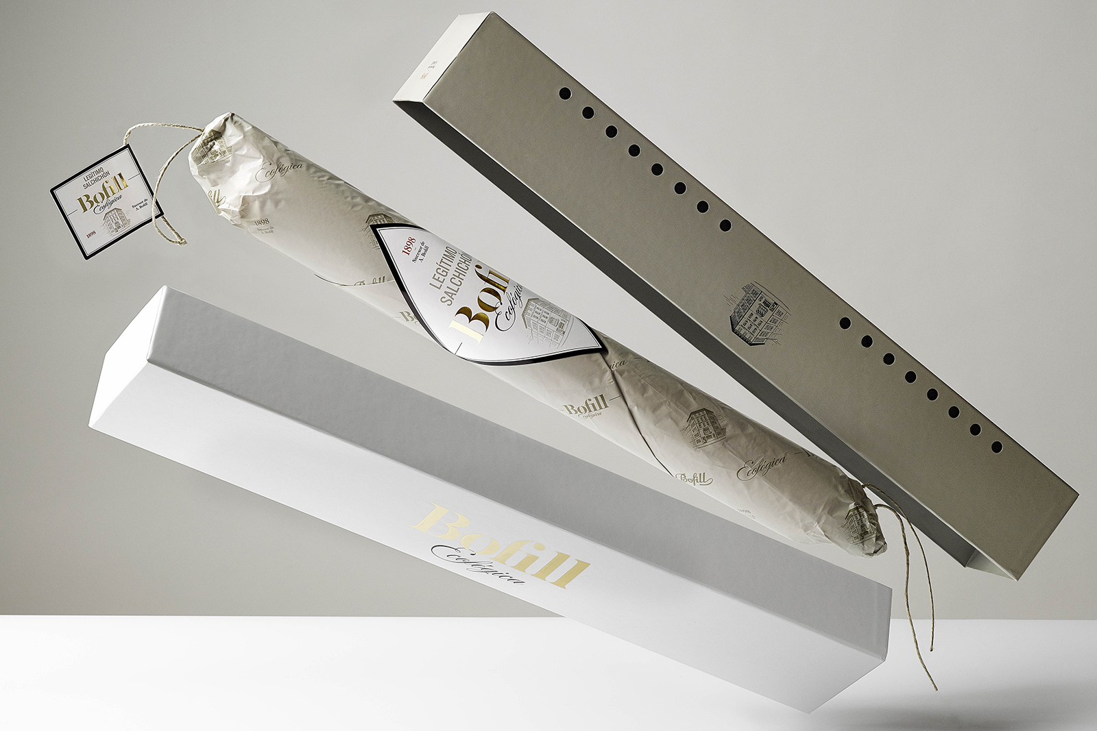
Design of the new Bofill identity. The briefing was aimed at giving a new look to their only product, the Bofill llonganissa (cured sausage). In this new phase for the brand, the client wanted to add a new characteristic to the packaging: the fact that it is an organic llonganissa.


The excellent quality and organic production will make Bofill one of the most prestigious llonganisses in the world. The brand began in 1894 and in this new evolutionary phase, the design respects the graphic and printing resources of the period but updates them to give the necessary distinction to the new product.


The duality of the brand’s legacy of quality and tradition juxtaposed with the organic aspect is the basis for the design. A combination of the more sophisticated part with the natural, pure nature of the product.


The use of an elegant typography with stencil characteristics afford the brand the required level of sophistication and the gold stamped finishes make them stand out against the other elements.

On the packaging, the natural tones combined with white spaces help to transmit purity and naturalness. Some original elements, such as the illustration of the factory, have been updated and enhanced to give them more status in the design; this also helps them to transmit the brand’s current values.


