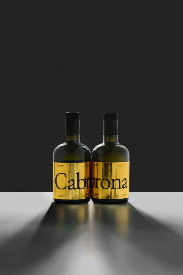
Cabrona — Set & Ros
Packaging
This is a project of design in which several factors are aligned to execute a risky project. A briefing that explains a very unique product, a variety of olive oil that is not suitable for all tastes, powerful and astringent, difficult to harvest and expensive to produce. With a clear intention from our customer: to be transgressor both in speech and in design and with the naming proposal “Cabrona” (“Bastard”).

With these premises, we began to work on the copies with a speech without filters and with a cheeky tone to present the product while claiming authenticity, freedom and the empowerment of being different.
Copys
Do you think you're more bastard than others because you think you've lived to the limit and that you've tried everything? Well, I'll be honest: I'm more bastard than you.
Indomitable, inaccessible, spicy, astringent and unique in my kind.
I am sexy and radical, but also sybarite and selective. I don’t fit with any dish and I am not commercial. And no! I don't want any commitments and I'm going against the tide.
Because half measures are shit! Fuck coupages, finesse and "for all tastes". I look at myself in the mirror and I like myself just the way I am.
Accept me as I am and if you don't like me, fuck you!
-
I'm 100% meña. A strain that was getting lost, because my performance is a fucking shit. Yes, yes, just as you read it. The olive is very close to the tree and harvesting me is fucking hell. A brave olive that was planted in rough terrain because I have this ability: I survive in any terrain. Traditionally, they picked me up too ripe not to have a shitty time during the harvest and as a consequence, a shitty oil came out, excessively sweet. But these guys from Set&Ros are killers and they harvest me at my optimum point, even green, to get an oil with character, ¡as it should be!


In terms of design, we have a premium product, both because of the scarcity of the product and of its production costs. The design must convey luxury in every way. And it is with this contradiction, copies versus design, with which we wanted to focus the packaging project. As a classmate said years ago, "with a nice typo, even whore sounds nice," and that is the idea.


The pack features a mirror gold finish, we use a serif typography, with all the elements neatly placed and with no design artifices. With the idea that at first glance and for those who do not read it, it looks like a premium product. The moment when you pick it up, you pay attention to it and start reading what it says, Boom! Here comes the kicker. The contrast between what is perceived with the eye and the tone of what is read leaves no one indifferent.

There are two sides with copies, in Catalan and in Spanish. The other two sides have a a composition of the naming "Cabrona" that we have deconstructed. We want to make a visual game to convey the idea and process of selective harvesting regarding olives.
The mirror gold material that we have used is reused. In collaboration with the printer we have been accumulating and saving this material that is used to protect the paper when it is transported on a pallet block.


