Solution — Chocolat Factory
Packaging
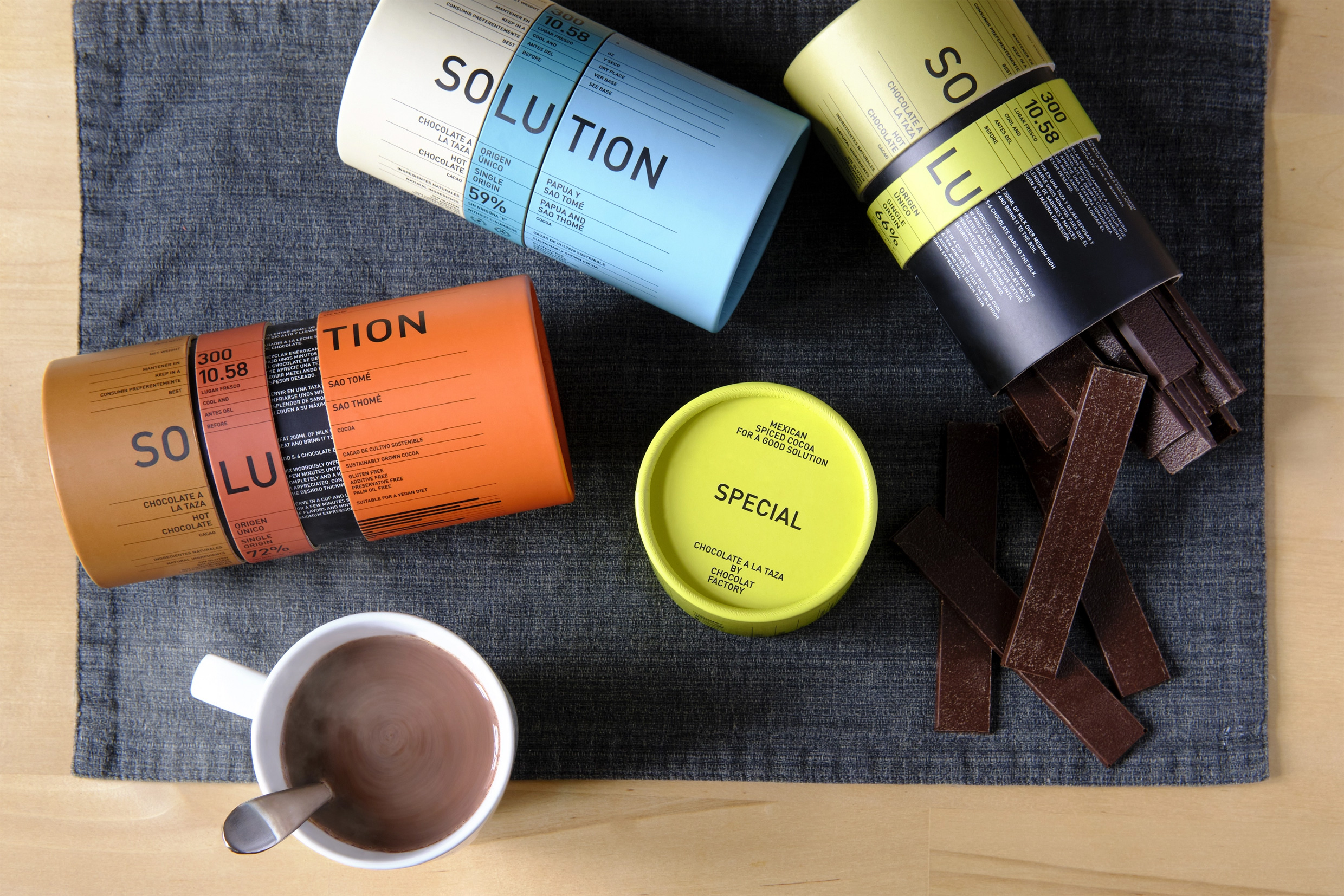
Chocolat Factory is a well-known brand of chocolate products with 17 stores. Chocolat Factory has tasked us with designing packaging for their new range of hot chocolate products. The client has requested a design that follows the brand's defining style, but not in a completely strict way. The controlled use of typography, as the main element of design, and solid colors define the identity of this brand since its creation.

The project includes the creation of a naming, and our proposal is based on a double meaning concept: “Solution”. It refers to the dissolution of chocolate in liquid and at the same time, also to the idea of solving.
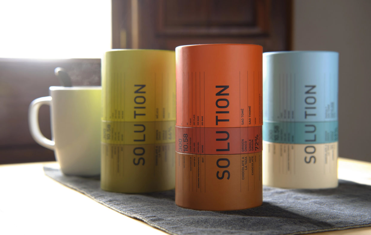
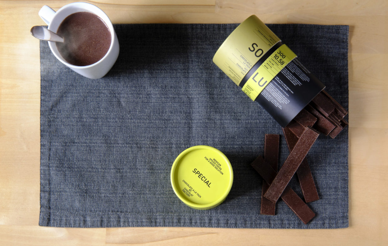
Continuing with this idea of the naming “Solution”, for the packaging design, we propose a cylindrical structure and a game based on dividing the format into 3 parts; the base, a central ring, and the lid. Both the ring and the lid can rotate in both directions. If you match the three parts, you have all the information ordered, you have achieved the solution.

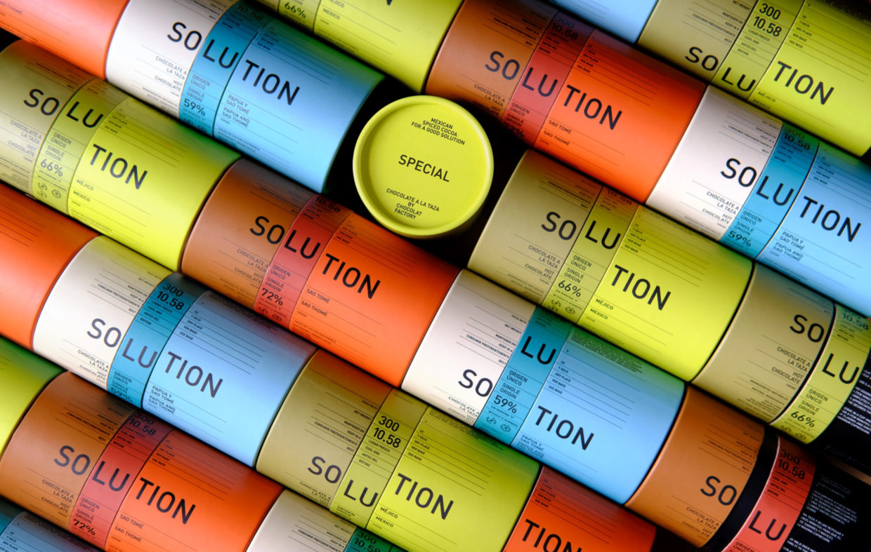
The packaging range consists of three products. Through composition and typography, we give unity to the range. On the contrary, we use color combinations to differentiate the products and describe the characteristics of each one: with milk, with spices, and 72% cocoa.
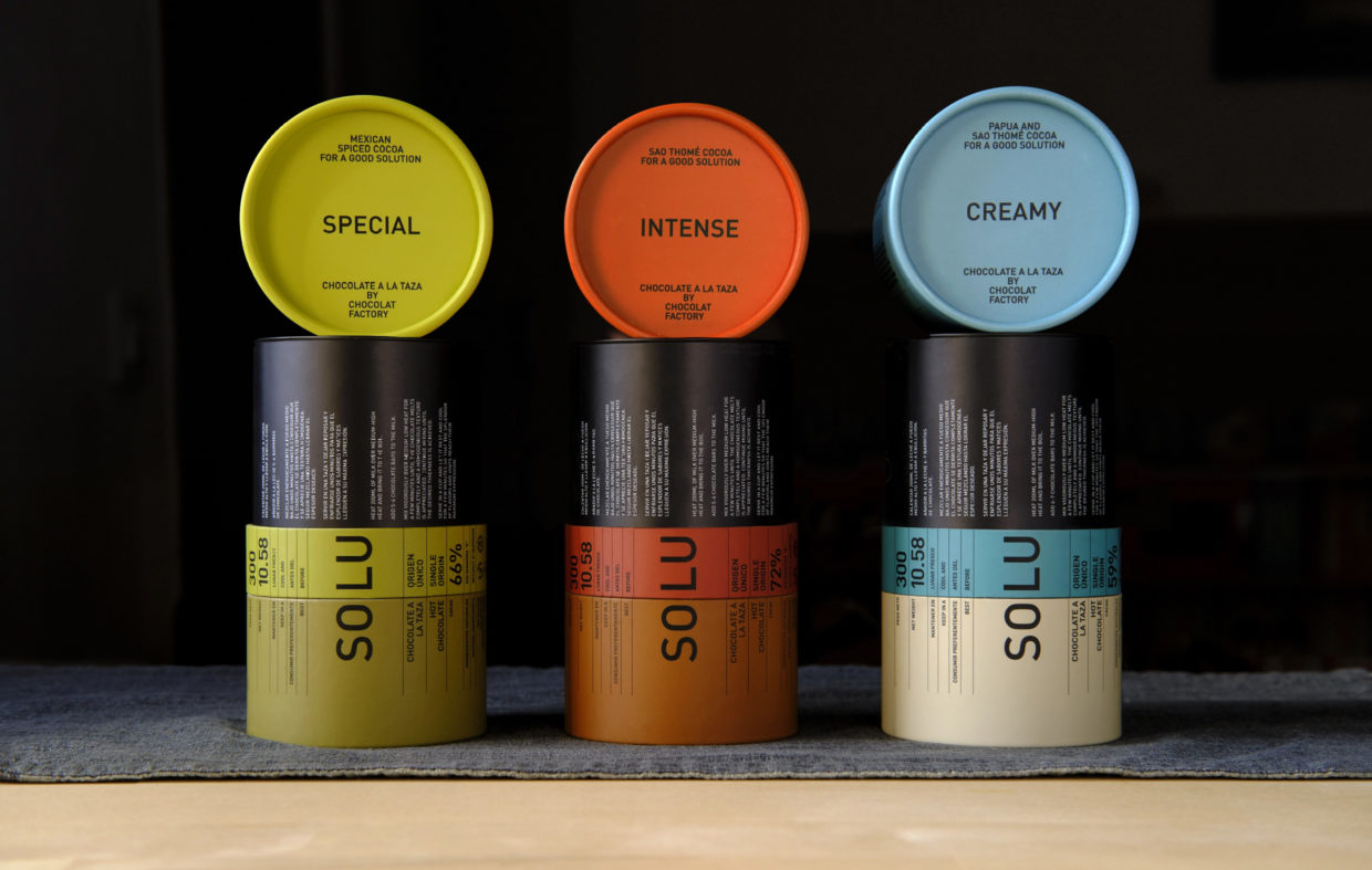
Once the lid is removed, we find the usage instructions. We use this interior surface to place technical texts accompanied by a battery of icons.


Awards
ADCE 2023 — Bronze — Packaging
Laus 2023 — Bronze — Pack line and/or label

